
BRANDING
FALL 2025
PROJECT OVERVIEW
Cotton On is a good-first fashion brand based in Geelong, Australia. Cotton On stands for fun, sustainability, and realness, striving to hit those goals with every endeavor. This rebrand takes the brand values and transforms them into a fun and laidback brand identity. This rebrand consists of a new wordmark, font and color pallete, along with mockups of their current products, all displayed on a stylescape.
IDEATION
The goal for this project was to create a stylescape with the brand system redesign. This would include the wordmark, typography, color palette, mockups and accompanying photography. I chose the brand Cotton On because it's one of my favorite brands and I like knowing the history of the brands or companies I enjoy.
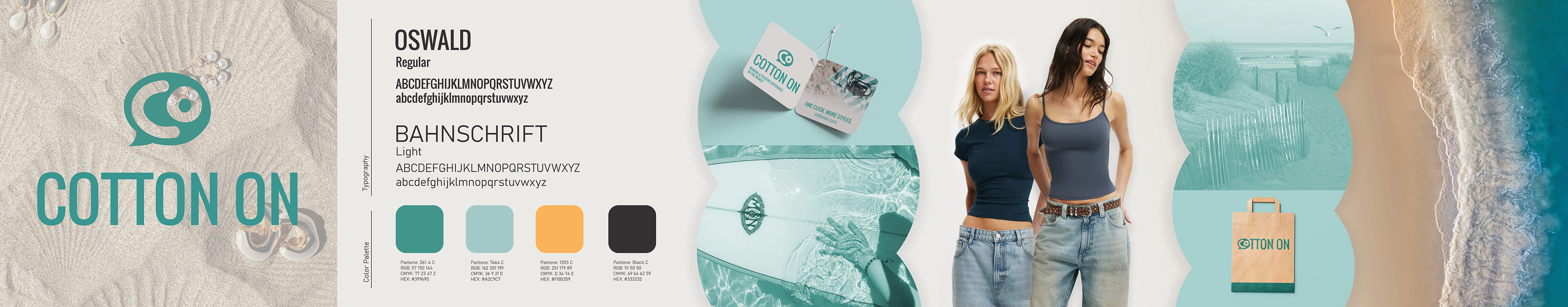
Cotton On Stylescape
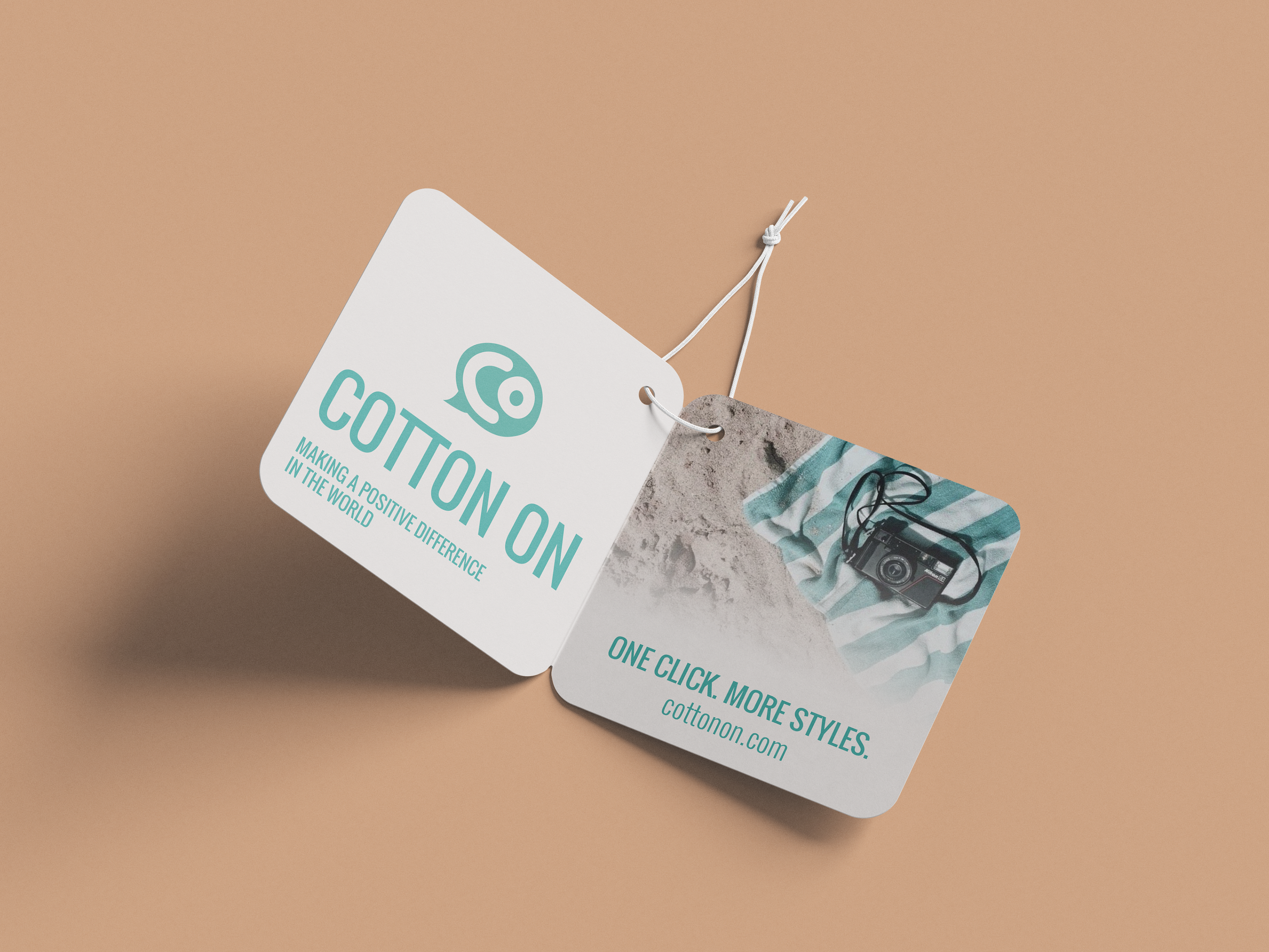
Clothing Tag Mockup

Teal Shopping Bag Mockup

Black Shopping Bag Mockup

Tote Bag Mockup

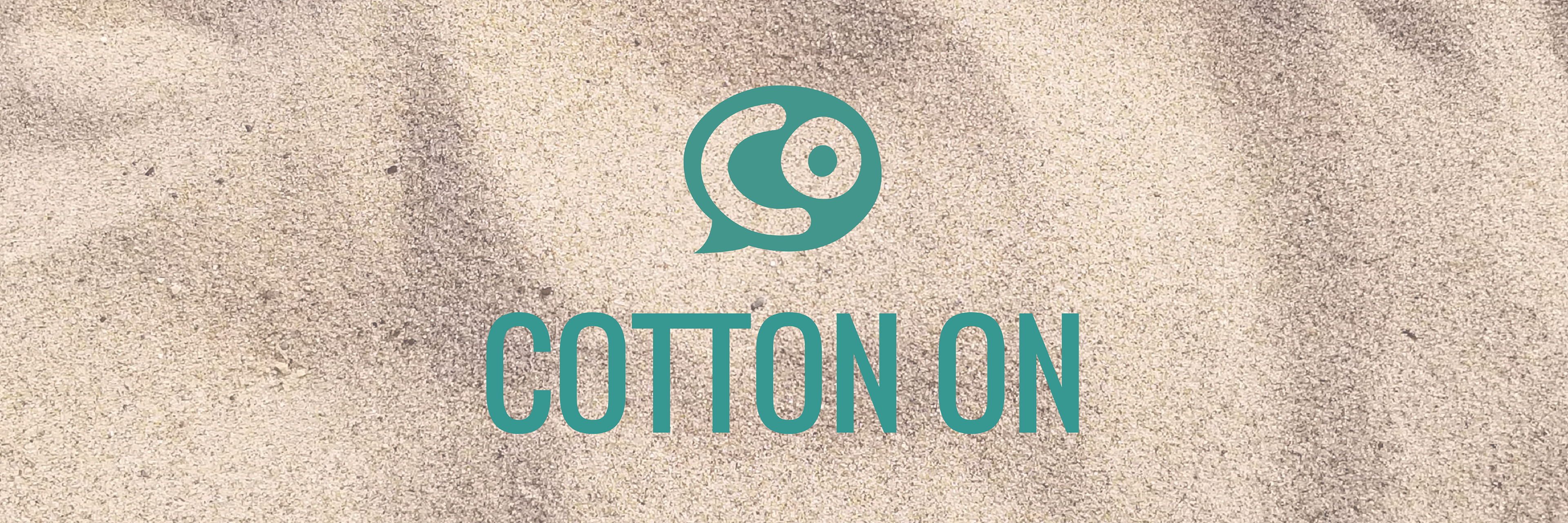
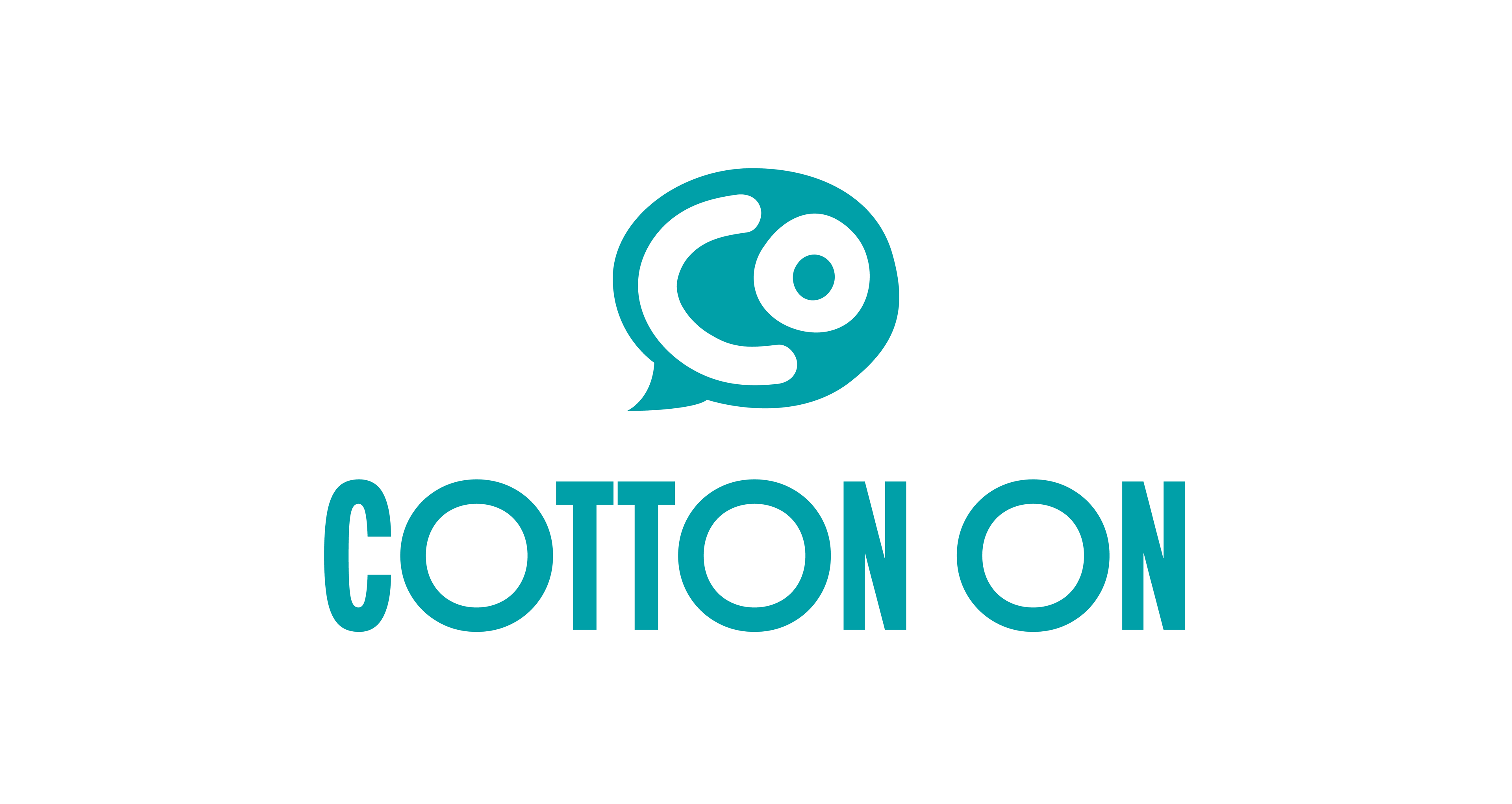
Vertical Logo Lockup

Horizontal Logo Lockup
PROCESS
My process began with researching the brand and its values. After learning more about the brand, I made a mind map, mood board, and sketches with different logo concepts. One idea that never left my mind was the phrase "Cotton On" was a shortened version of australian slang. I drew a speech bubble with the initials of the brand to subtly show the verbal inspiration of the brand's name and it stuck.

Mind Map
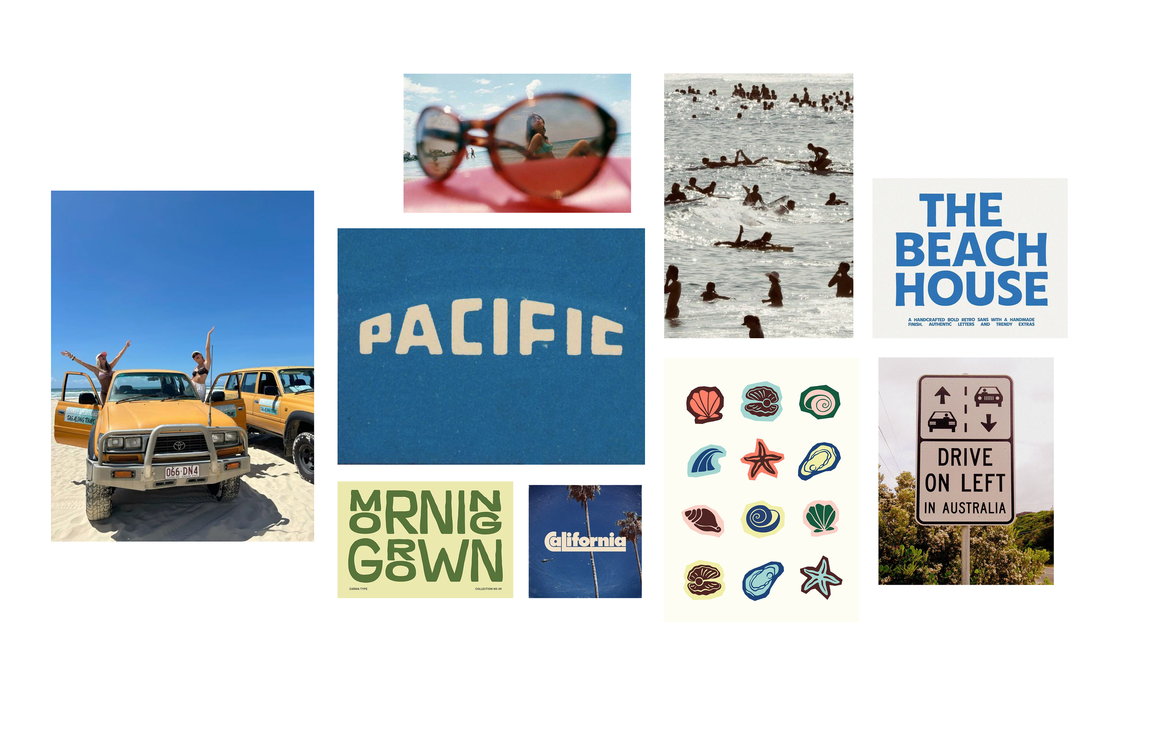
Mood Board
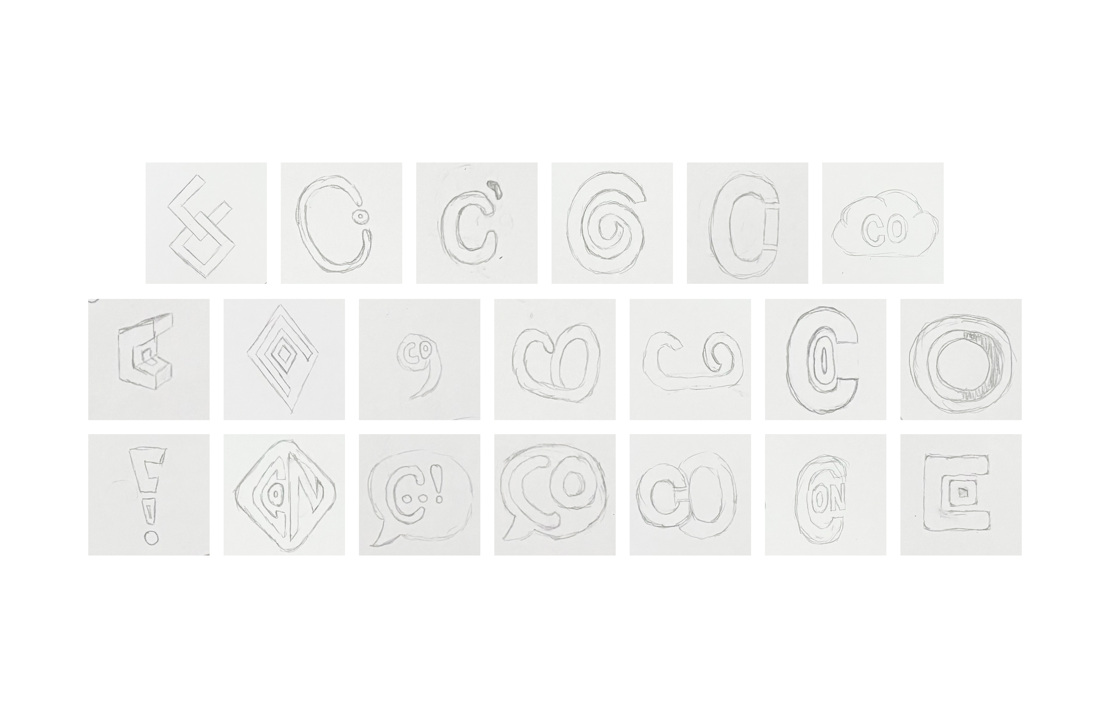
Logo Sketches

Initial Logo Iterations
The next steps were to develop the wordmarks and the color palette. I initially wanted to use a font that had the "O" match the roundness of the logo but I got the feedback that it was too distracting. For the color palette, I was inspired by Cotton On's emphasis on the beach in their social media as well as the laidback language used in their brand values.

Horizontal Logo Draft
Vertical Logo Draft

Official Typography and Color Palette
I found difficulty trying to find the right font for the wordmark as I wanted it to be playful but not too illustrative as I didn't think it fit with the brand's values and the direction that I was taking it. I wanted a tall font so the height of the logo could fit with the height of the type. I realized that the lockup was a pairing and not a competition between the two elements so I narrowed my search to fonts that was the logo's opposite and I liked the result.

Vertical Lockup Diagram
